The Overview and the Challenge
The challenge presented to me as a Freelance Senior Product Designer was to redesign and reimagine the corporate landing page for Sankalp Taru (ST), a non-profit organisation dedicated to promoting sustainable development and preserving the natural environment through community engagement and innovative techniques. Their existing landing page was outdated and failed to effectively communicate ST's inspiring mission and vision.
To address this, I embarked on creating a visually engaging and user-friendly landing page that would resonate with ST's audience and evoke a sense of environmental consciousness.
The scope expanded to include crafting a new visual brand identity, encompassing a carefully curated colour palette and typography system, to reflect ST's values and commitment to creating a lush-green and bio-diverse sustainable world.
As a result, the revamped landing page aimed not only to inform visitors about ST's mission but also to inspire them to take action and be part of the environmental revolution through tree planting.
Collaborating with ST, I worked hand in hand to ensure that the redesigned landing page would set the foundation for the rest of the website, with their in-house team of designers and developers continuing the project. Witnessing their enthusiasm to carry forward the same level of creativity and purposeful design throughout the website was an incredibly rewarding experience.
This case study will showcase the design process, key features of the product, and the solutions devised to create a compelling and effective corporate landing page, serving as a source of inspiration for future designers working with non-profit organisations dedicated to making a positive impact on the environment.
Previous Landing Page Design

Creative Exploration and Brand Identity Development
Before delving into the design strategy and conceptualisation, I embarked on a journey of creative exploration and visual inspiration to pave the way for crafting Sankalp Taru's (ST) new brand identity.
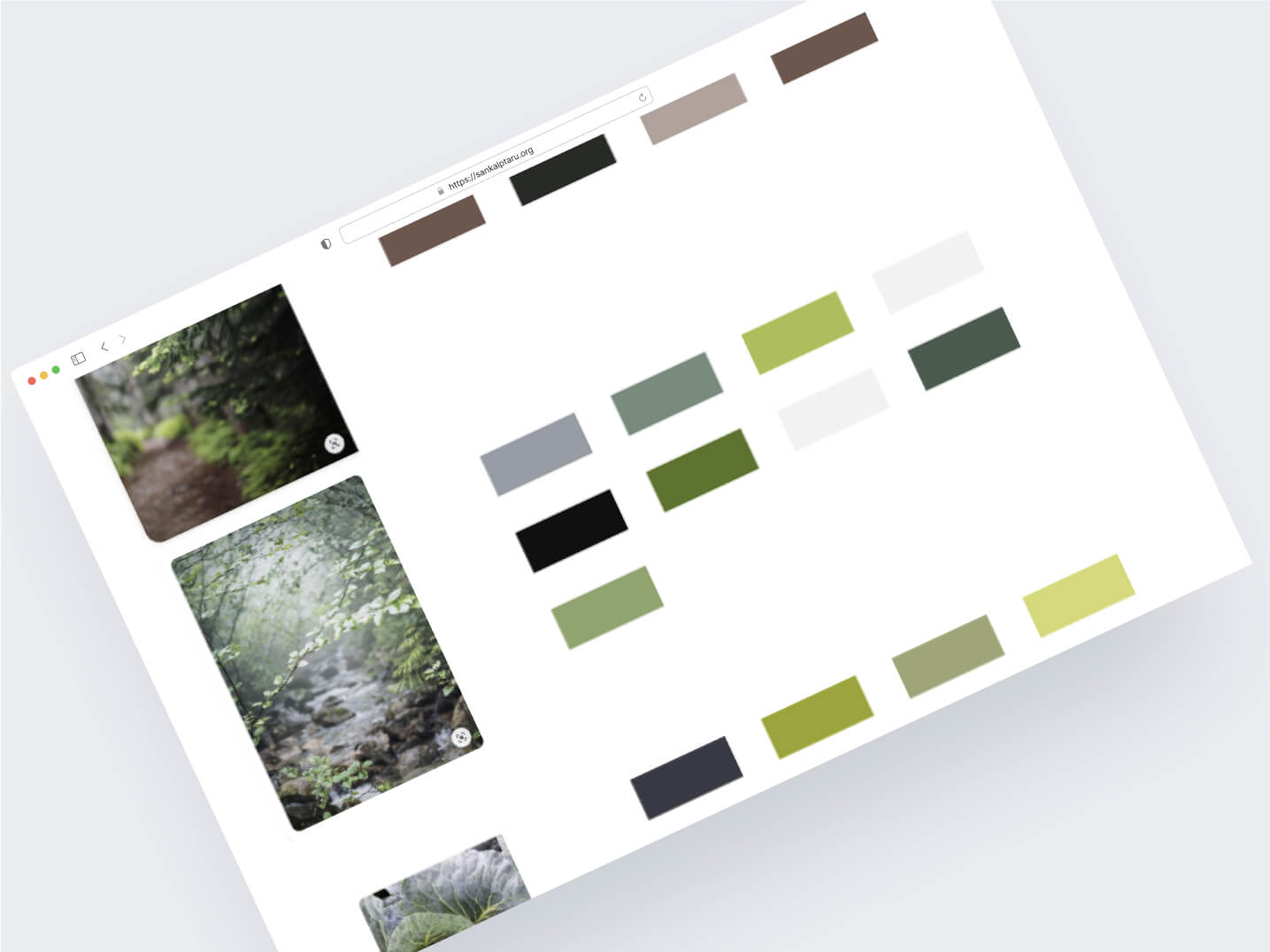
Drawing upon the organisation's mission to preserve the environment, I immersed myself in captivating forest images and verdant scenery, seeking to capture the essence of nature's beauty and the diverse hues it bestowed upon us. From the lush greens of thriving foliage to the earthy tones that ground us, each snapshot offered a wealth of inspiration for the forthcoming brand identity.
With a curated collection of imagery that resonated with ST's vision, I embarked on the task of distilling the visual essence into a harmonious colour palette. Careful examination and meticulous sampling of colours from the forest images allowed me to identify a set of hues that not only mirrored nature's splendour but also symbolised growth, vitality, and sustainability. This bespoke colour palette would serve as the foundation for ST's revitalised visual identity.
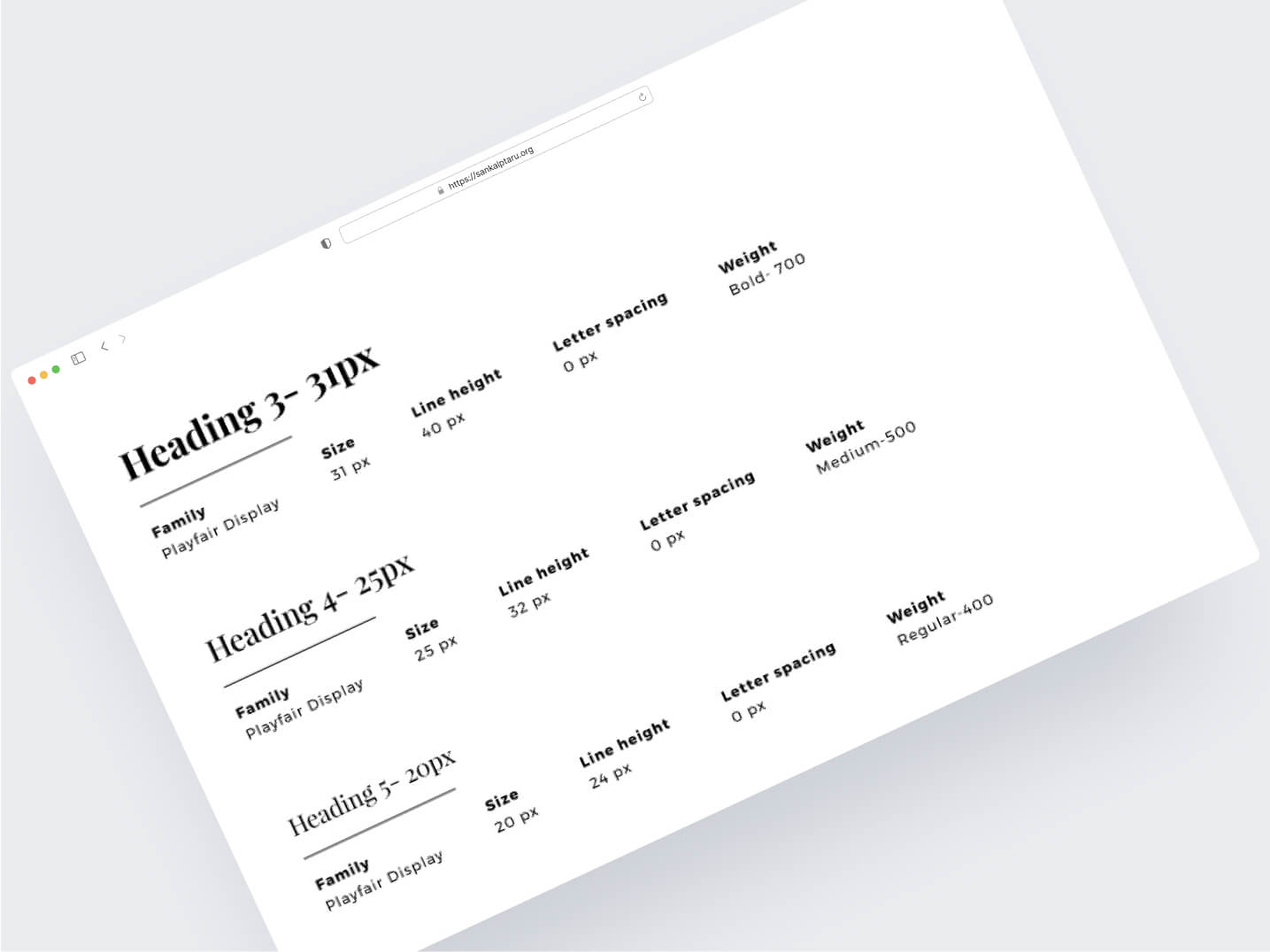
Additionally, typography played a crucial role in expressing ST's mission with clarity and elegance. My exploration of various typefaces led to the curation of a typography scale that seamlessly integrated contemporary aesthetics with an organic touch.
The chosen fonts embodied ST's dedication to fostering a connection between humans and the environment, reinforcing their mission through every piece of content presented on the landing page.
The "Inspiration and Visual Exploration" phase proved to be the soul-stirring origin of my subsequent design journey. Armed with the spirit of the natural world and the essence of ST's mission, I transitioned seamlessly into the "Design Strategy and Conceptualization" phase, where these insights would manifest into a captivating and purpose-driven corporate landing page.
Design Strategy and Conceptualisation:
My goal was to create a corporate landing page that not only resonated with Sankalp Taru's (ST) mission and vision but also inspired visitors to actively participate in their environmental endeavours.
At the core of the design strategy was the concept of fostering a deep connection between ST's audience and nature. To achieve this, I envisioned a visual narrative that would evoke a sense of tranquility, growth, and environmental consciousness. The design aimed to strike a balance between modern aesthetics and organic elements, symbolising the harmony between human life and nature.
To bring the concept to life, a new visual brand identity was meticulously crafted. The colour palette was inspired by the lush greens of a thriving ecosystem, symbolising growth, vitality, and sustainability. Complementary earth tones were added to imbue a sense of groundedness and to highlight the interconnectedness of all living beings.
Careful consideration was given to the typography choices to ensure readability and visual harmony. The selected fonts blended contemporary elegance with a touch of natural fluidity, reinforcing ST's commitment to a harmonious coexistence with nature.
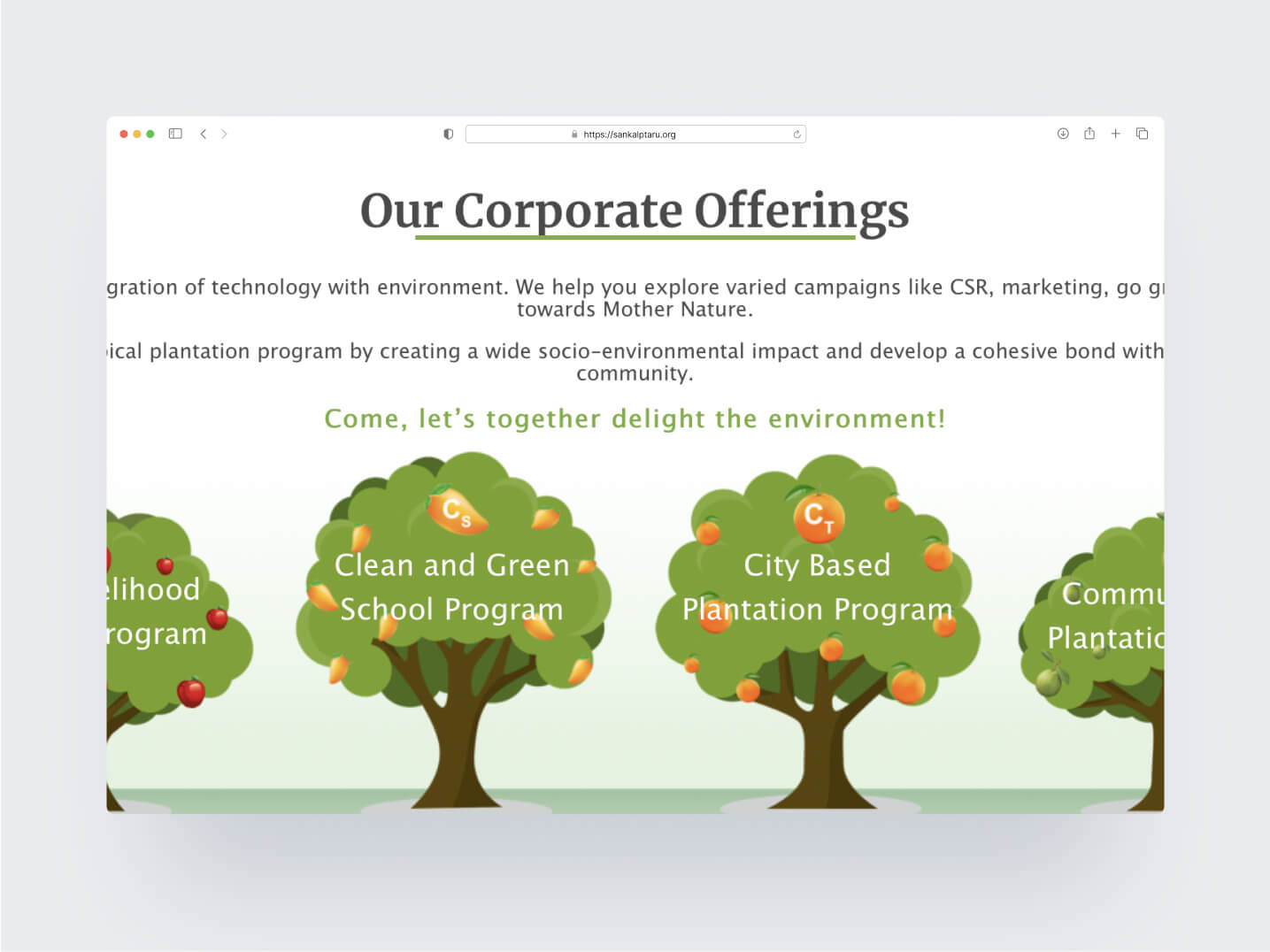
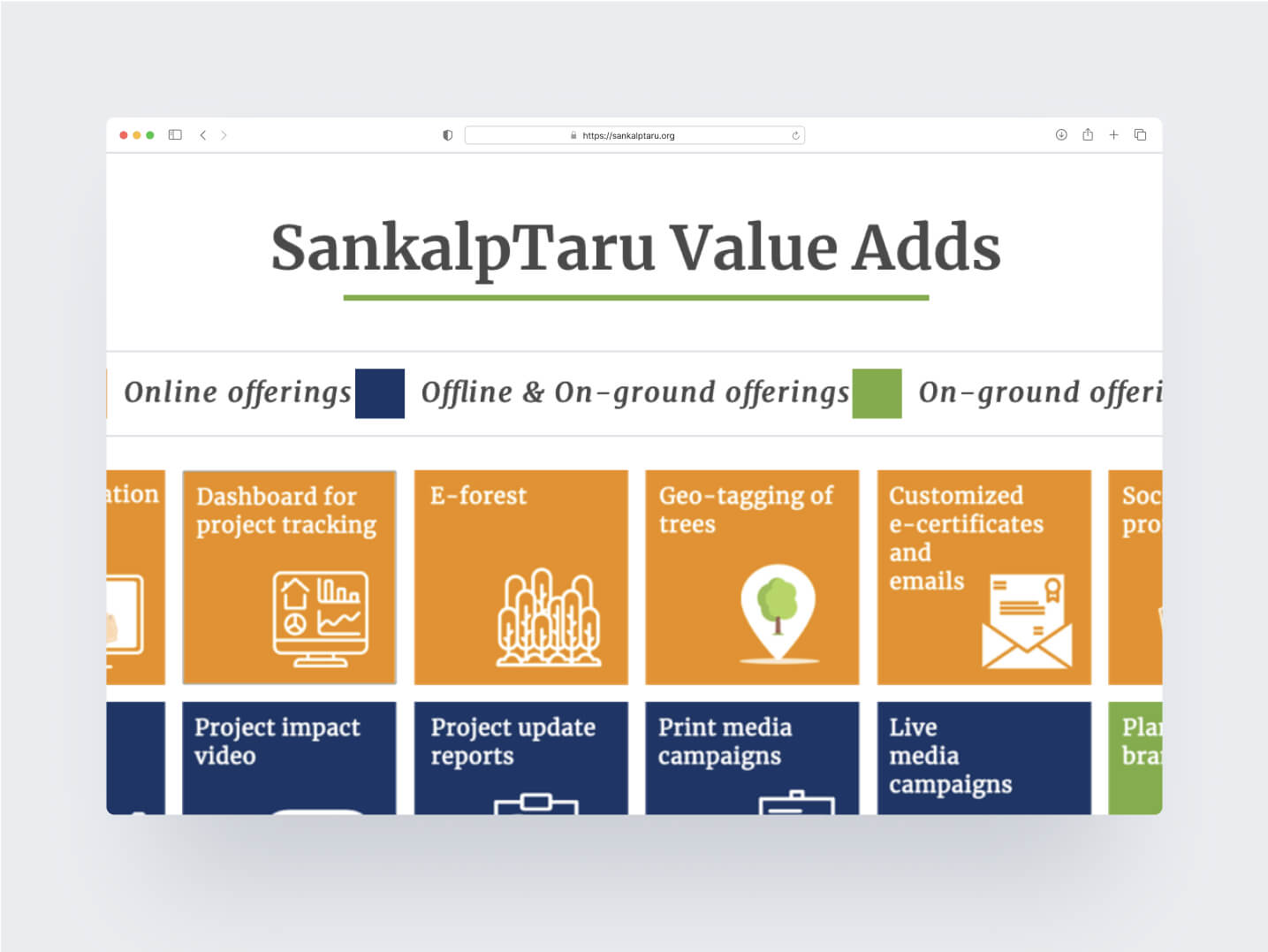
Moreover, the landing page's layout and user interface were designed to be intuitive and user-friendly. Each element was strategically placed to guide visitors seamlessly through ST's mission, projects, and the different ways they could actively contribute to the cause.
The design strategy was driven by a purposeful intent: to communicate ST's profound mission and vision through a captivating and user-centric experience. By combining creative concepts with meticulous attention to detail, we aimed to ignite the spark of environmental consciousness within every visitor, empowering them to take part in the collective effort to protect and preserve the planet for generations to come.
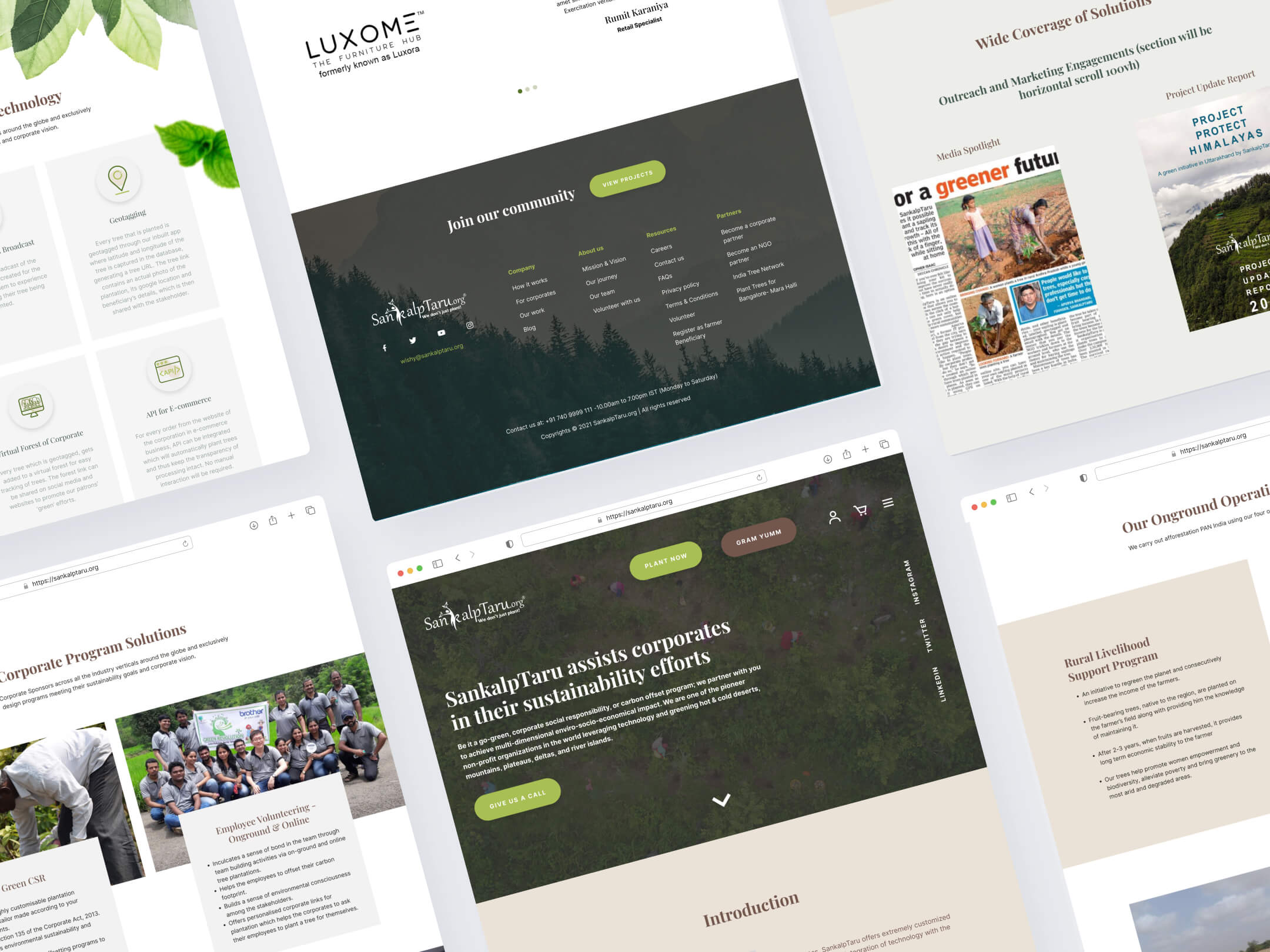
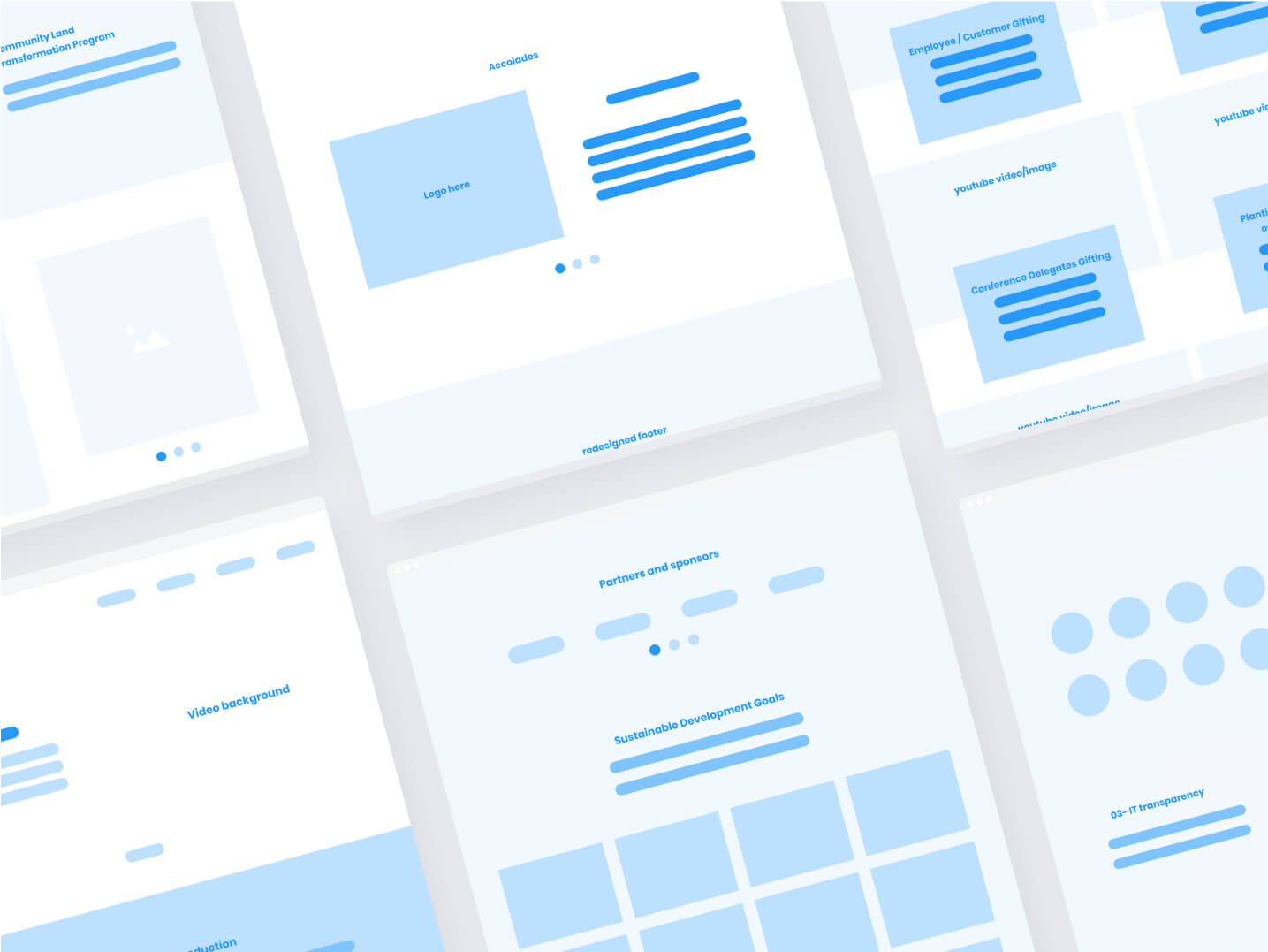
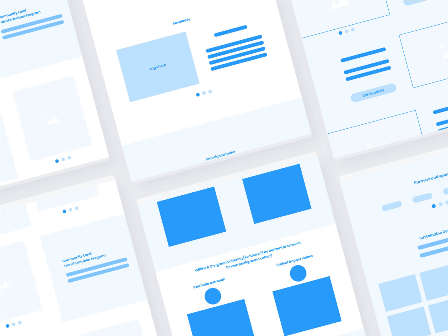
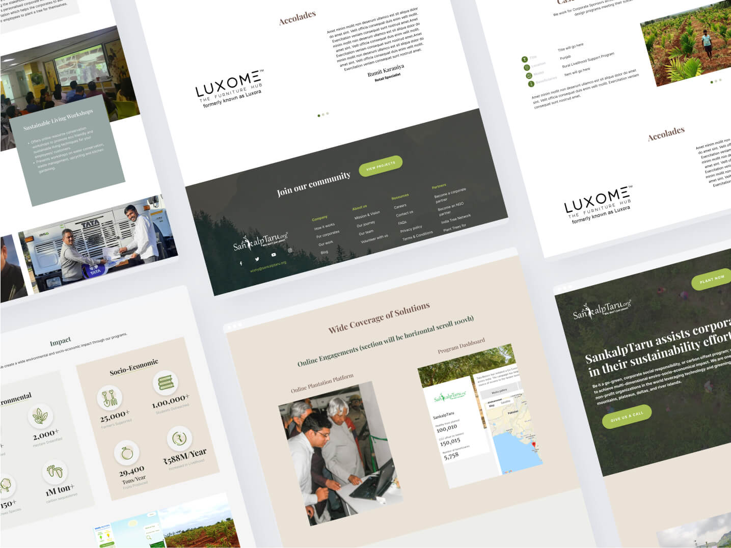
Wireframes
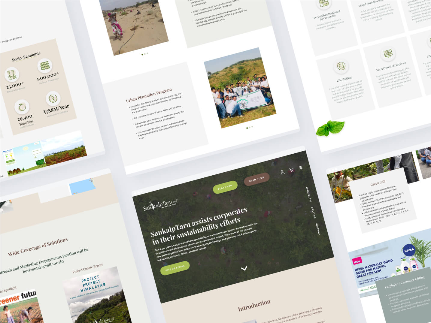
High Quality Designs
Results and Impact
The redesigned landing page for Sankalp Taru had a positive impact on both the organisation and its audience. People appreciated the design, leading to increased engagement and interest in ST's projects.
The user-friendly layout encouraged active participation in ST's environmental efforts. The nature-inspired colours and fonts emotionally connected visitors to the importance of nature, receiving praise for fostering a sense of responsibility towards the environment.
Ultimately, the redesign helped ST reach a broader audience and inspired greater environmental consciousness and involvement in their mission for a greener world.