Introduction
POM View is a revolutionary healthcare business committed to preventive screening for the most common, devastating diseases and cancers.
As a Freelance Senior Product & Logo and Brand Identity Designer, I had the privilege of collaborating with POM View to establish a robust brand identity that would effectively convey their mission to detect and prevent life-threatening health conditions.
Client background
POM View operates in the healthcare industry, catering to individuals seeking advanced preventive screening services. Their target audience includes health-conscious individuals, as well as those with a family history of diseases.
POM View approached me with the challenge of developing a brand identity that would resonate with their clientele and build trust in their state-of-the-art screening technology.
Project Goals and Objectives
The design brief provided by POM View outlined the need for a distinctive logo that could embody their preventive screening services. They wanted the logo to evoke a sense of reliability, compassion, and modernity.
Additionally, they sought a carefully curated colour palette and typography that would complement the logo and create a cohesive brand identity.
Lastly, the project involved the creation of comprehensive brand guidelines to ensure consistent and effective use of the brand across all platforms.
Research and Inspiration
Before delving into the design process, I conducted extensive research to gain a deep understanding of POM View's services, target audience, and the broader healthcare industry.
This research phase involved studying competitors and analysing market trends.
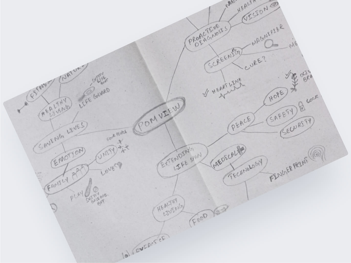
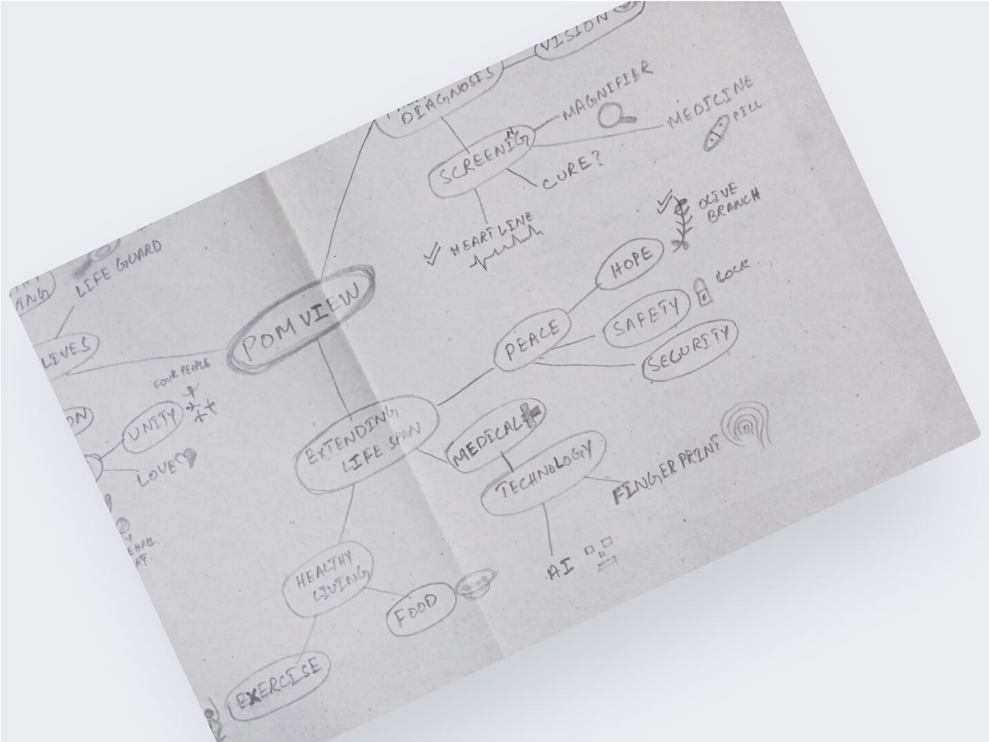
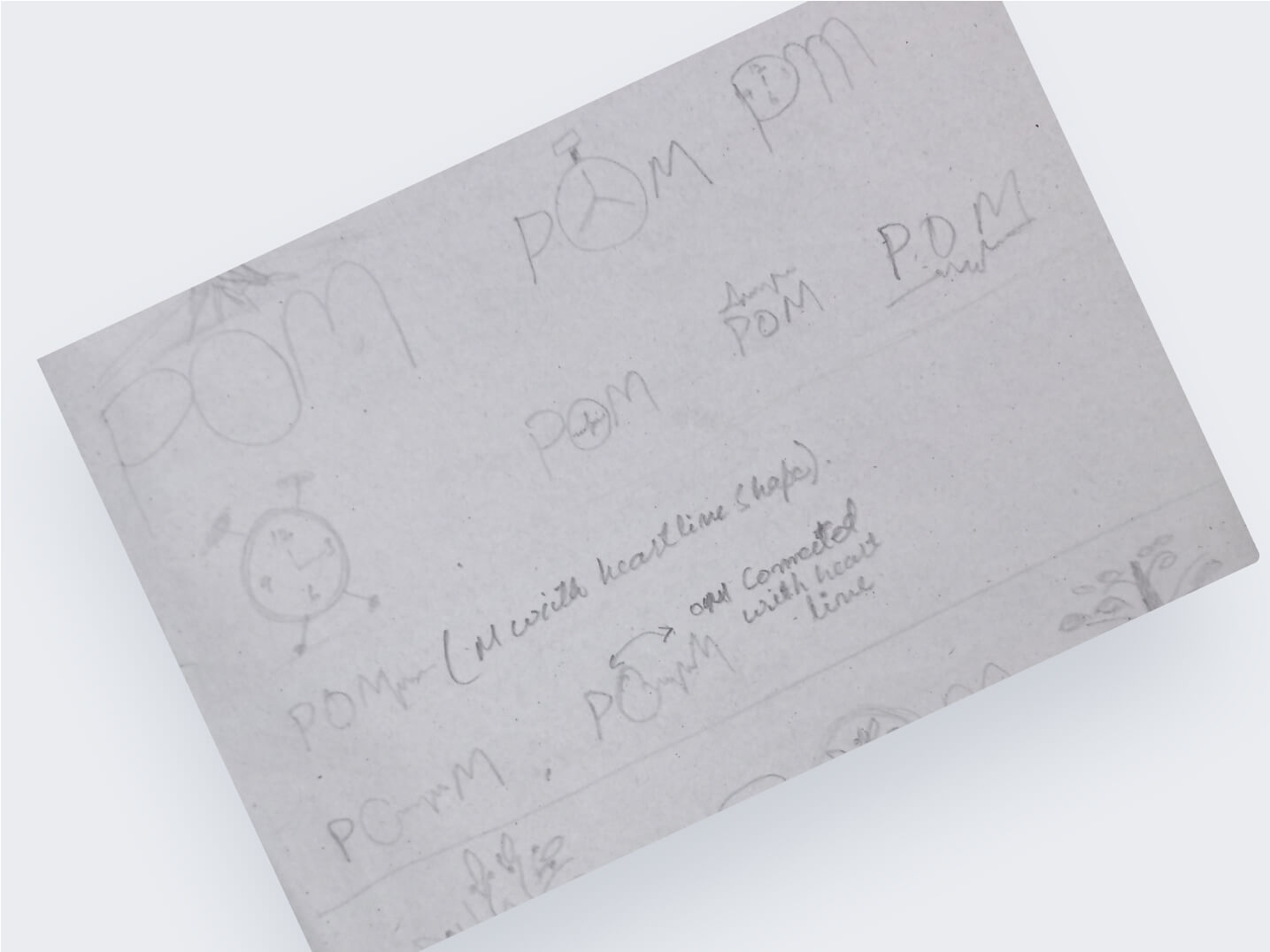
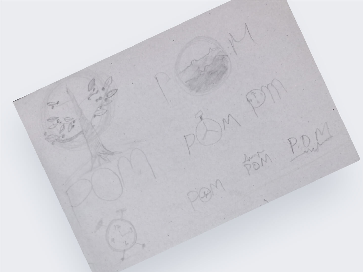
Throughout the research and ideation process, I sketched numerous concepts, exploring different design elements and compositions. These sketches served as the foundation for the eventual logo design and helped me refine the visual representation of POM View's brand.
The sketches not only allowed me to experiment with various ideas but also facilitated collaborative discussions with the client, ensuring that the final design was aligned with their vision.
The combination of in-depth research and creative inspiration from sketches formed the basis for a powerful and meaningful brand identity that effectively communicates POM View's commitment to advanced preventive screening and a healthier future for their clients.
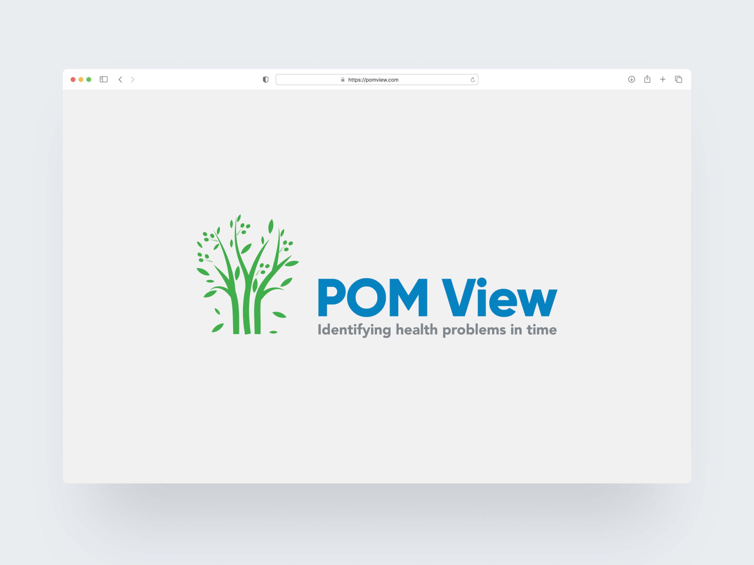
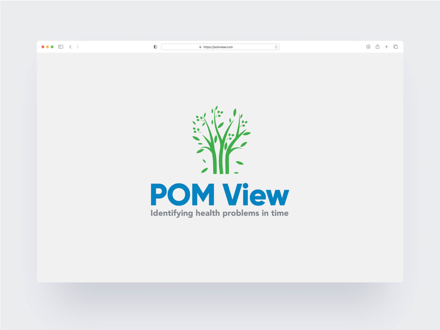
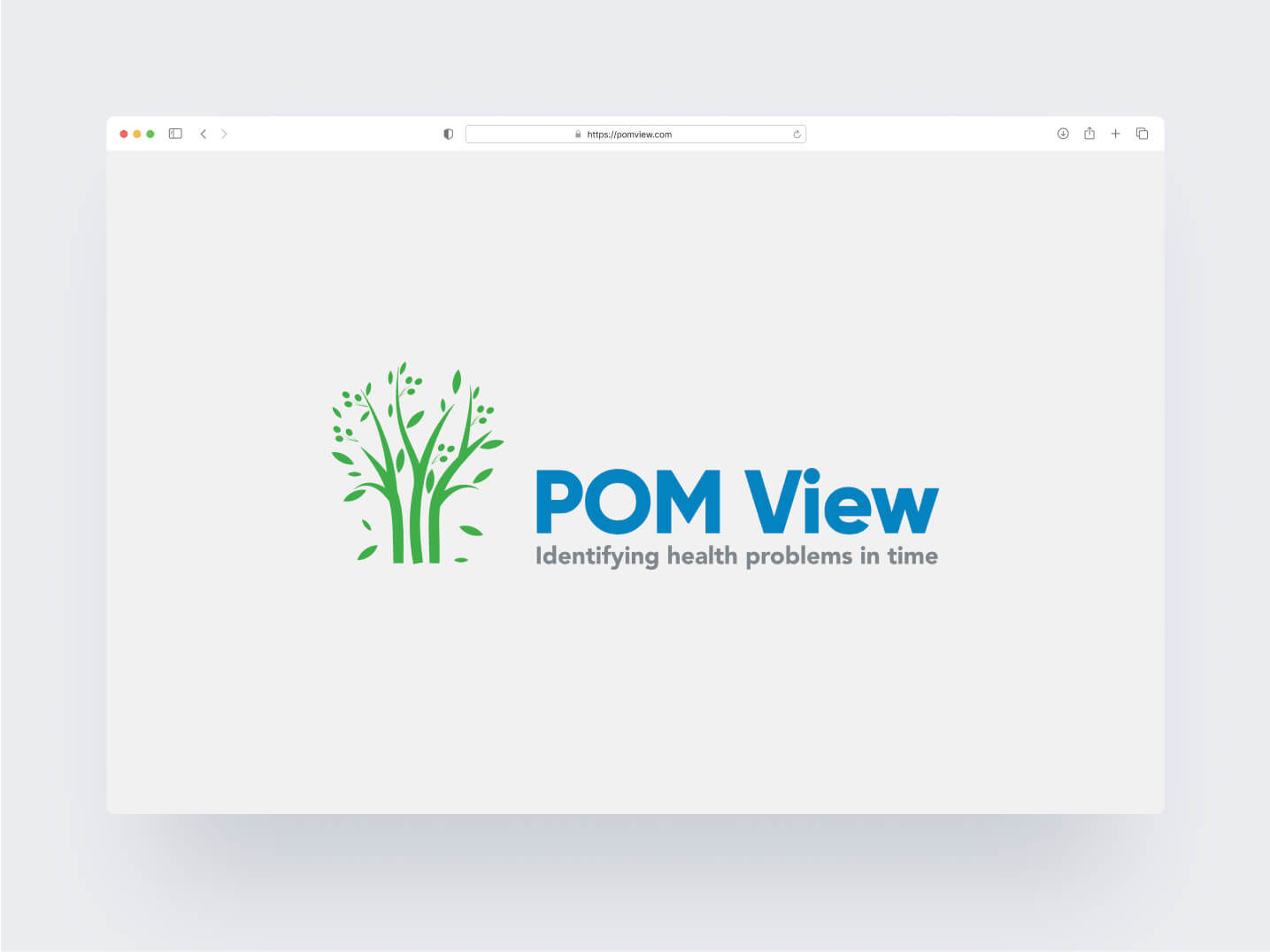
The logo design for POM View was a result of in-depth research and profound inspiration drawn from the company's mission and historical symbolism. The idea of using a tree and olive branches with a soothing blue and calming green colour palette was rooted in a profound metaphor, invoking the biblical story of Prophet Noah's Ark.
The inspiration came from the moment when Prophet Noah's ship finally found land, and the storm subsided. A dove was sent out, and it returned carrying an olive branch in its beak, signifying hope, renewal, and the end of a challenging journey. This poignant symbol of resilience and promise aligned perfectly with POM View's commitment to preventive screening, where early detection offers hope for a healthier and better quality of life.
The tree symbolised growth, vitality, and a solid foundation for health and well-being. Its strong roots mirrored the company's dedication to helping individuals understand their health risks and halt the progression of diseases before they become life-threatening. The intertwining olive branches represented the connection between POM View and its clients, with a promise to bring hope, peace, and healing on their journey to a healthier future.
During the design process, I meticulously sketched various iterations, experimenting with different tree and olive branch configurations to find the perfect balance of symbolism and aesthetics. The chosen blue and green colour palettes evoked a sense of trust, tranquillity, and natural vitality, reinforcing the logo's message of advanced preventive screening and a caring approach to healthcare.
Incorporating this profound historical symbolism into the logo design ensured that POM View's brand identity not only represented their modern technology but also conveyed a timeless and compassionate message that resonated deeply with their audience. The logo became a powerful emblem of hope, embodying the company's vision to help clients live longer, healthier, and more fulfilling lives.
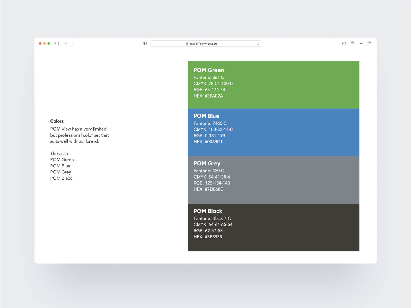
Colour Palette & Typography
The selection of an appropriate colour palette played a vital role in communicating POM View's brand values.
We opted for a harmonious blend of deep blue and calming green tones. Blue symbolised trust, expertise, and technology, while green represented health, growth, and well-being.
The colour combination evoked feelings of reassurance and positivity, aligning perfectly with POM View's mission.
The typography selection was a meticulous process to ensure the chosen fonts matched the brand's personality. We opted for a clean and modern sans-serif font for the company name, exuding professionalism and clarity.
For the tagline and supporting text, a friendly and approachable font was chosen to establish a personal connection with the audience. The typography choices complemented the logo design and enhanced the overall brand identity.
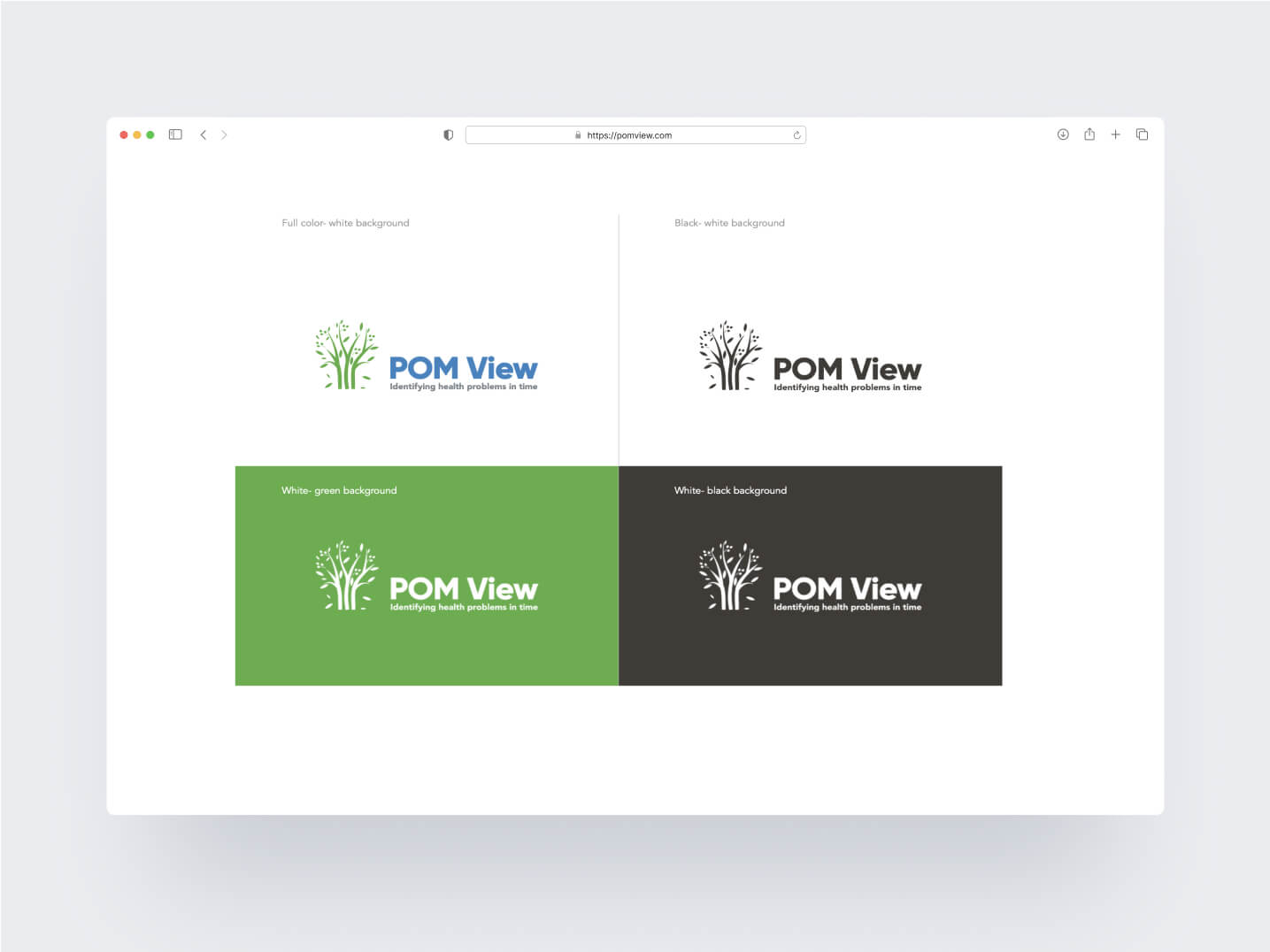
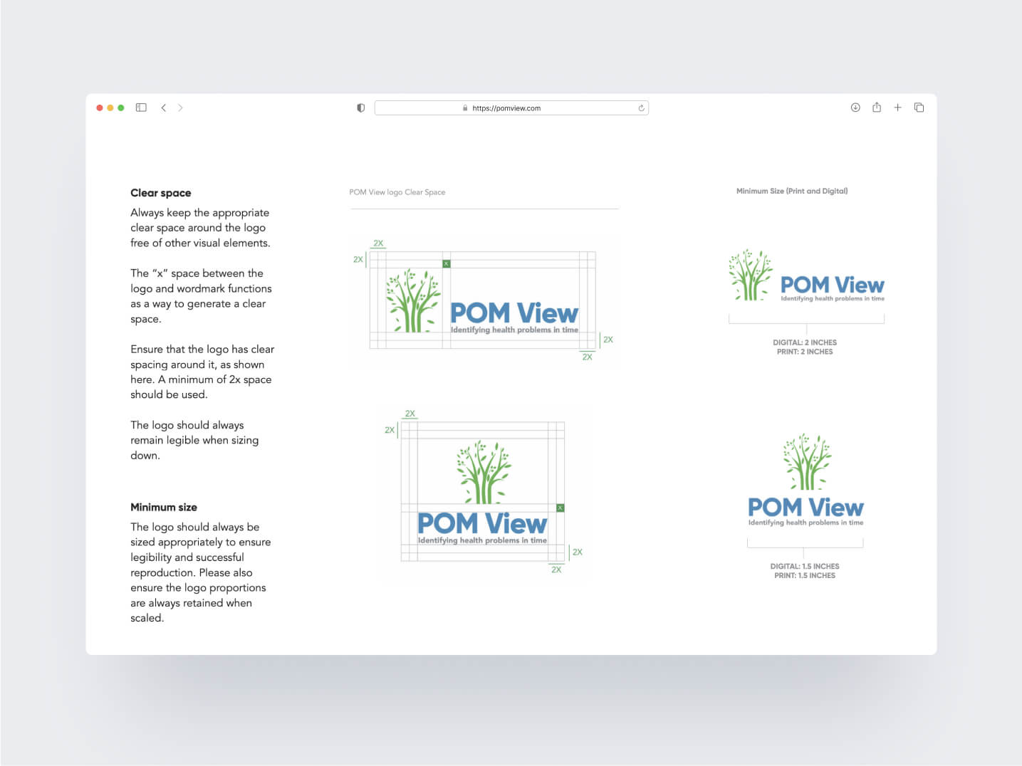
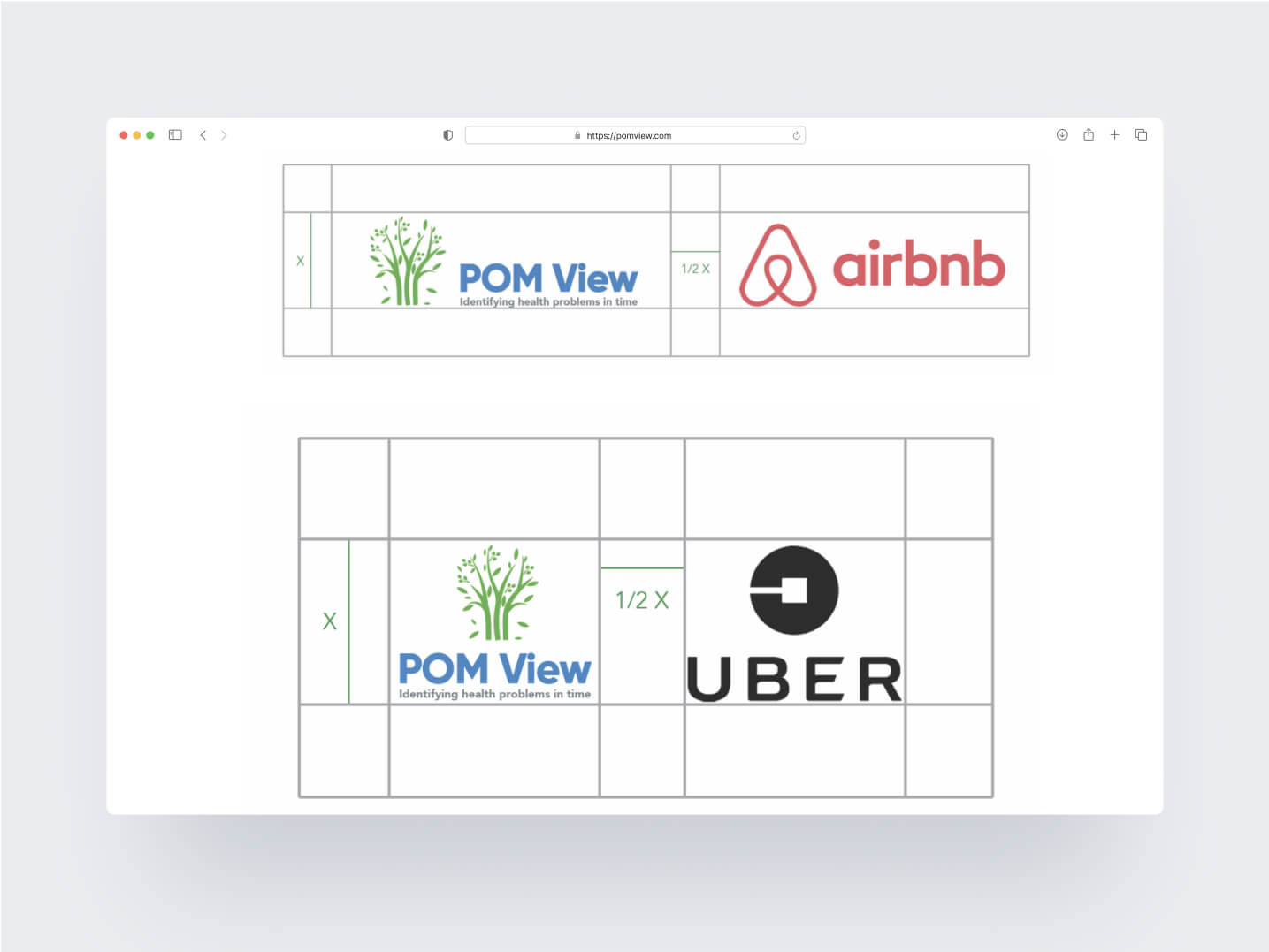
Brand Guidelines
To maintain consistency and ensure the proper usage of the new brand identity, I created comprehensive brand guidelines for POM View.
The guidelines covered logo variations, clear space, colour usage, typography guidelines, and applications across various platforms. This ensured that everyone involved in representing POM View, whether in-house or external partners, adhered to a unified and cohesive brand image.
Design Implementation
The new brand identity was implemented across a wide range of touch points, including business cards, letterheads, brochures, website, and social media profiles. The consistent application of the logo, colour palette, and typography across these channels helped reinforce POM View's brand presence and enhance brand recognition.
Impact and Results
The positive impact of the new brand identity was evident in POM View's increased brand awareness and engagement. Users responded favourably to the modern and caring image portrayed by the brand.
POM View reported a significant rise in the number of screenings booked after the brand launch. The brand guidelines also empowered the internal team to maintain a consistent brand image, ensuring a cohesive experience for their clients.
Conclusion
Working with POM View was a gratifying experience, and I am proud of the result. The new brand identity successfully communicates the company's commitment to advanced preventive screening and reflects their mission to help individuals live longer, healthier lives.
The project's success highlights the significance of thoughtful and strategic branding in making a positive impact on a business and its audience.